Our Brand
This webpage has been created as a reference to guide the visual communication and design of the TRU brand and introduces our refreshed identity.
If you have any questions about the use of TRU’s brand, please contact the TRU marketing team.

What's in a name?
The first five letters of our company name spell T-R-U-S-T. Since 2010, we’ve been the global leader in high-caliber, diverse talent in the privacy, ediscovery, and cybersecurity industries. With tens of thousands of specialized professionals at all levels, we enable corporations, law firms, and legal services providers to drive efficiency and growth and adapt to demanding and fast-changing regulatory and business landscapes. We’re proud of the level of trust we’ve earned with all our clients and candidates.
About our Logo:
The TRU Circle of Trust
Our logo is a circle of trust, imperfect on the outside, a perfect circle on the inside, with TRU right in the center leaving just enough room for people to enter and exit. Our swoosh is true blue, representing our loyalty toward the clients and candidates we represent and, in turn, their loyalty to us.
Using our Logo
The TRU logo represents us at the highest level and is a vital part of our brand. The following examples are intended to demonstrate how to use the logo across a variety of situations. Follow these guidelines to ensure it always looks its best.
Our Logo
The TRU logo is a universal signature we use across all our communications. We want it to be instantly recognizable, so consistency is important – please don’t edit, change, distort, recolor, or reconfigure it. Our logo includes both the glyph and text. One cannot exist without the other. Scroll down for guidelines on how to display the TRU logo.
.png)
Clearspace Guidelines
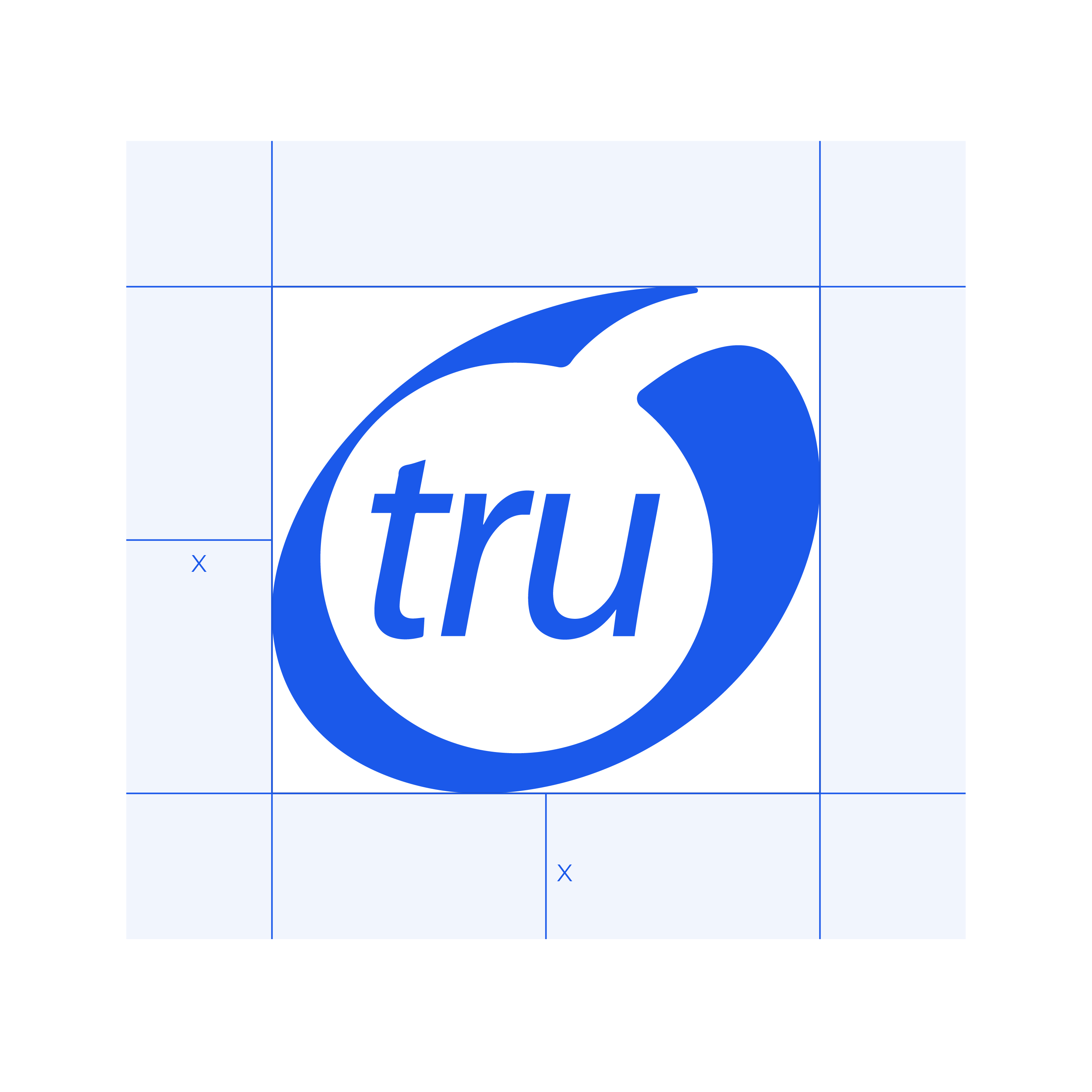
A minimum area of clear space must always surround the TRU logo. This area of isolation allows the logo to stand out by ensuring that any copy, additional identities, or other visual elements are kept clear from the logo. The clear space is a padded area, defined by X–the logo should be kept free of any intruding elements.
Unapproved Uses
It is important that the appearance of the logo remains consistent. The logo should not be misinterpreted, modified, or added to. Its orientation, color, and composition should remain as indicted on this page – there are no exceptions. The following examples illustrate how it should not be used.
01 - Do not change the color of the logo or elements of the logo.
02 - Do not put the logo in a container or shape.
03 – Do not skew or alter proportions of the logo.
04 - Do not place the logo on low contrasting color.
05 - Do not overlay gradients or effects.
06 - Do not place the logo on busy or complicated backgrounds.
07 - Do not add effects to the logo.
08 - Do not rotate the logo.
Our Colors
Beyond our logo, color is the most recognizable aspect of our brand identity. Using color appropriately is the easiest way to ensure our materials reflect a cohesive TRU brand. Our color system is extremely flexible, but it is important to maintain a sense of balance when using the TRU color palette. Each color may be used at varying tints as needed for different applications.
PRIMARY
Trusted TRU
PRIMARY
Ultra-Blue
SECONDARY
Dark Indigo
SECONDARY
Cerulean
TERTIARY
Cloudless
SECONDARY
Typography
Consistent use of typography is crucial to bringing a brand to life. Our modern typeface balances versatility with legibility. It doesn’t distract or cloud TRU’s message.
Primary
Monserrat
Montserrat comes in 17 weights, including Thin, Light, Regular, Medium, Semi-Bold, Bold, Extra-Bold, and Black weights.
Substitute
Century Gothic
When Montserrat is not available or applicable, use Century Gothic as a substitute in Microsoft applications (standard availability).
TRU Staffing Partners, Inc.
Ediscovery, Cybersecurity, & Privacy Staffing
Substitute
Poppins
When Montserrat is not available or applicable, use the Google font Poppins as a substitute for web applications.
Icons
Icons are an easy, simple way to convey a message without language. They can communicate messages quickly and grab attention. Icons should remain all the same color to keep in line with cohesive branding.

Corporate Boilerplate
TRU Staffing Partners is a globally recognized, award-winning contract staffing and executive placement search firm representing talent and opportunities in data privacy, ediscovery, and cybersecurity. TRU’s global network of top talent has earned extensive accolades, including as an Inc. 5000 Fastest-Growing National Company 2016 (#1043), 2017 (#1189), and 2021 (#4189); an Inc. 5000 Fastest-Growing Regional Company 2021 (NY Metro #175); first place for National Law Journal’s 2018 Legal Outplacement/Career Transition Coaching and 2016 Best National Legal Recruiter; and 2019 Hall of Fame recipient in the Best Legal Recruiter category. TRU represents tens of thousands of active and passive job seekers and has successfully placed thousands of professionals in the Fortune 1000, Am Law 200, and global software, service provider, and consulting firm communities. TRU maintains an exclusive global roster of contract data privacy, protection, and discovery talent ready to deploy on-premises or remotely instantly. Being represented by TRU means inclusion in an elite circle of exceptional companies and professionals.
%20(1).png?width=150&height=51&name=LinkedIn%20Company%20Profile%20Image%20(Email%20Header)%20(1).png)


